

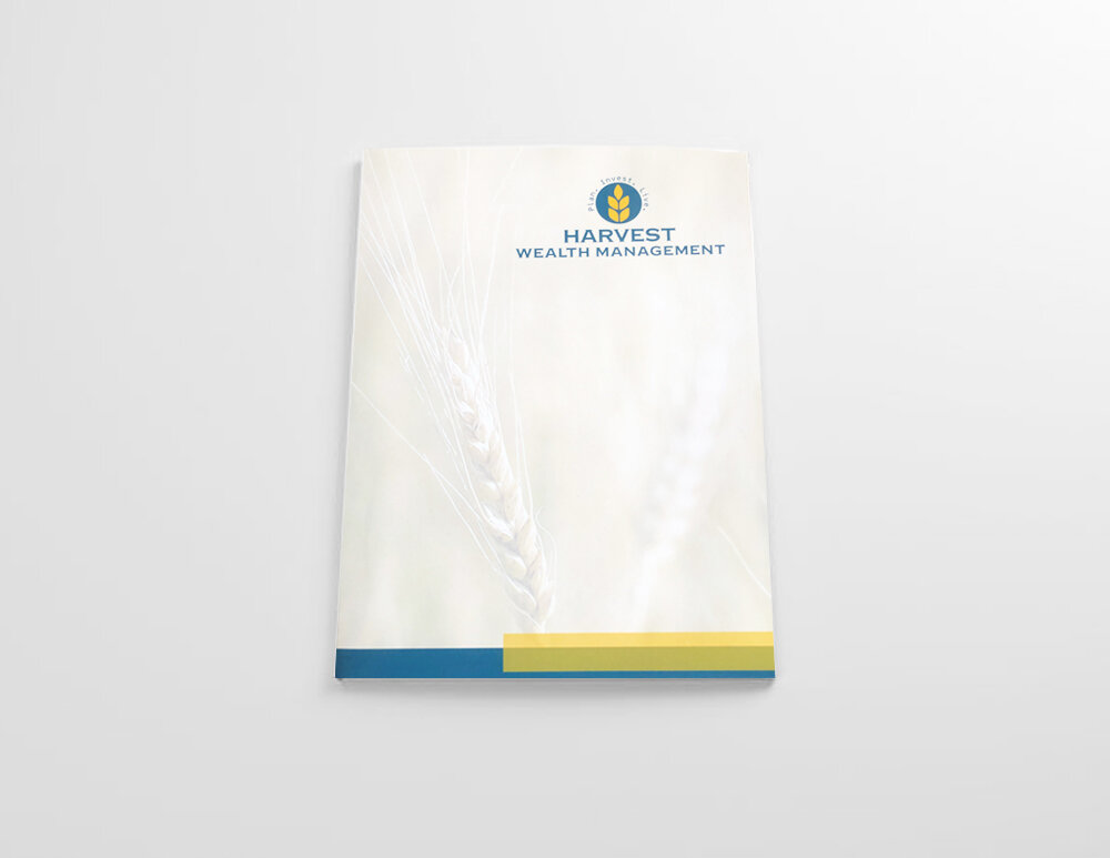
Harvest Wealth Management
Logo design & Brand identity
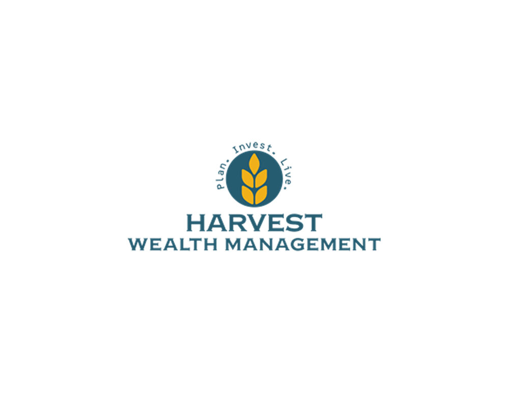
Harvest Wealth Management’s approach is defined by a commitment to growth. Placing their clients first and providing the steps to an easy and enjoyable experience in the process of meeting your financial goals. Plan, Invest, Live embodies this process and illustrates the roadmap they set fourth.
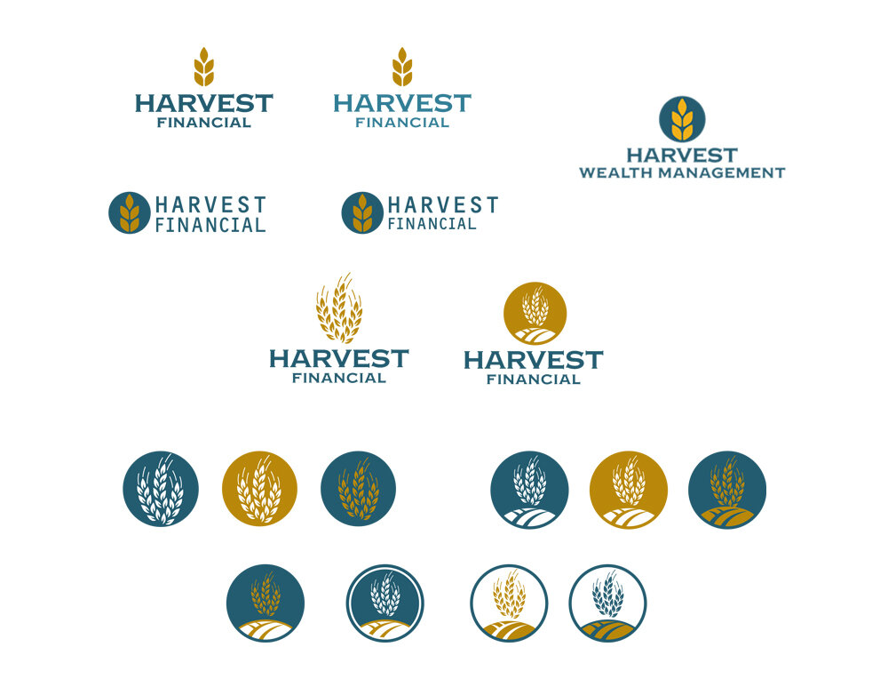
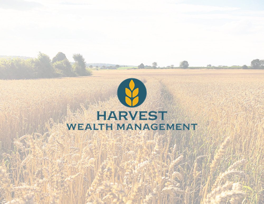
In designing their logo and wordmark, the goal was to convey a sense of strength and reliability while maintaining a clean and simple design aesthetic. The modern use of complementary colors and a subtle serif font creates visual interest while still adhering to the principles of simplicity. Combining this with a continual nod to their brand name and location, you’ll notice a similar color palette the city flag of Milwaukee and an imagery mood board that reflects a a professional pattern rooted in nature and harvest.
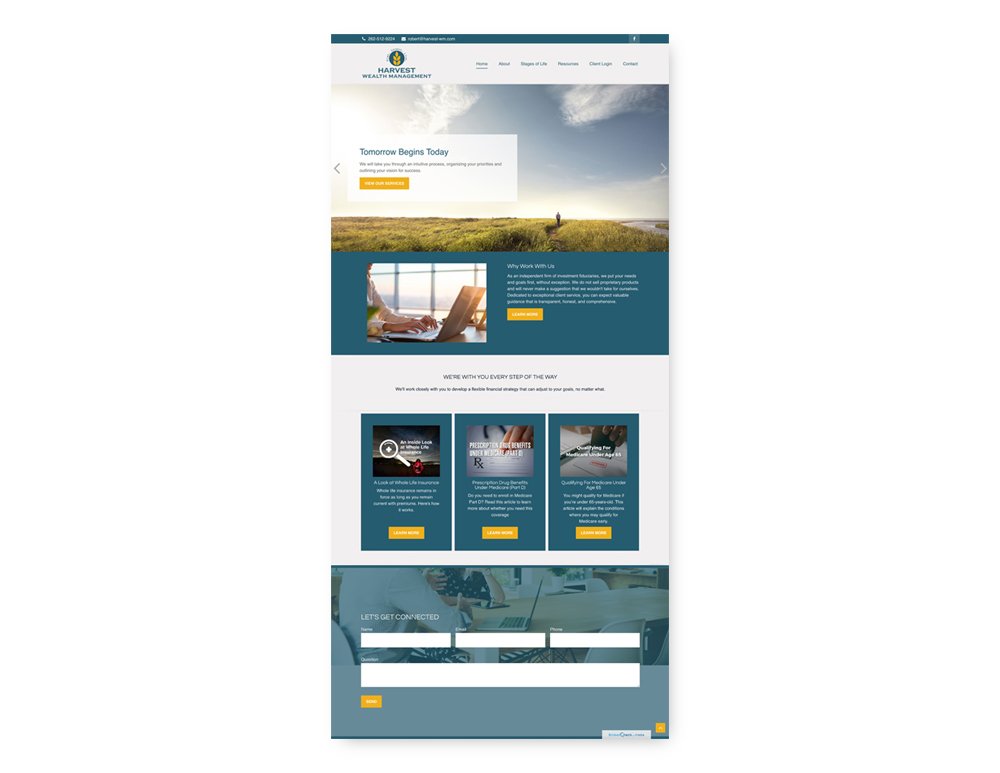
The resulting logo and wordmark are versatile and can be used together or separately for effective brand recognition. By combining a minimalist approach with strategic use of color and typography, the design is both engaging and memorable. This approach reinforces Harvest's core values and emphasizes their commitment to providing a high-quality experience for their clients.